How to Analyze a Stock Chart?
If you watch CNBC you will probably be blown away with the amount of stock data data information that is shown and wonder how to analyze stock charts and get the useful stuff from that. Political news isn’t always so helpful because it’s often what they want you to know and not what is actually happening that is affecting the stock markets. If you take a little time you can learn for yourself what you need to know and how to analyze stock charts in five seconds.
Why Do We Use Stock Charts
If you follow the shows and magazines where you see the ups and downs of certain stock index or price, the chart will look a bit like this:
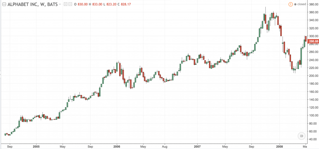
The reason why the stock scholars love this type of graph is because they are easy to follow and contain a huge amount of informational data. They truly believe that this historical information is all you need to predict which direction the stock is going to head. This is the technical analysis that pundits have used and debated over many years: taking into account the human elements of trading, can you actually predict from the past what the future will do?
Support and Resistance Levels
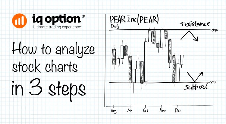
According to Wikipedia, which is the tomb of historical data on all subjects, over short time periods stocks do show clear indicators of levels of support and levels of resistance. In other words, support levels show a price that a stock can’t drop through and resistance levels are the reverse, where the stock price does not seem able to break out in upward turn. This flow in trading often holds true until a shock piece of information or news breaks the bubble, at which time a new “trade line” begins.
Using the example below, it shows in more detail what was happening on the Google Stock chart in Fig a.
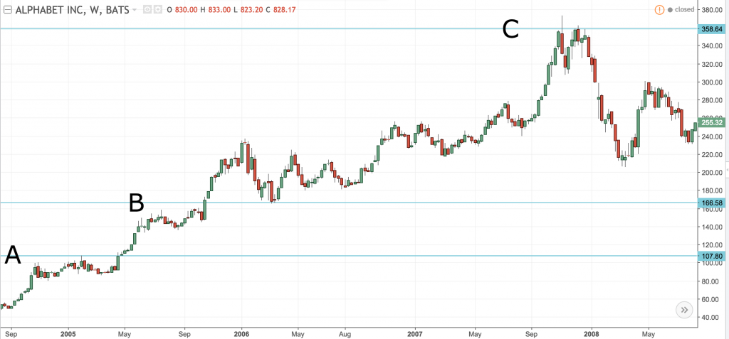
- A shows the line of resistance – IPO (initial public offering) August 2004 until April 2005, show that after the initial burst of interest the stock had a hard time breaking through the resistance level.
- Line B – Between April 2005 and October of the same year, the figures were once again staggering and there was another growth spurt.
- Between October 2005 and October 2008, it is easy to see what was happening to Google stock and indicators clearly show resistance level – Line C.
By following the example, it shows that if you put a buy order when the price is running around the 100’s as it was in early 2005, you will have make a profit when the price went above level A. Similarly, if you were following the daily charts closely around that time, you would have seen the candles beginning to jump around for a bit at about 107 and then rise sharply up to about 168 – level B, where big trade wins could have been achieved of around 120.
Taking Profits: Going through the Price Ceiling
In Fig c. the line D indicates that Google stock value pushed through 277. If you had put an order in around the 168 mark and were still in the market when the price pushed through the 277 barrier, you would have made a killing at the beginning or 2008, when the price peaked at around 358.
Not long after, if you had not taken you money and run for the hills, you would have been heading for disaster. The price dropped very sharply from July 2008 and fell to below 120 by October of the same year. The drop in price came on the back of the major economic disaster of 2008 and who knew that would happen in such technicolour and with such dramatic effect on every part of the world economy.
Reading a past performance chart is definitely part of the technical analysis that every stock pundit uses but in a lot of ways it is rather like reading tea leaves to see what the future will bring.
Apple stock was on an absolute high a few years ago until there was a rumour that Steve Jobs had had a heart attack, almost immediately, the stock fell to a 17 month low which in effect was a very significant 5.4%.
Recently, the US presidential elections had a significant effect on gold price, which dropped over $200 dollars per ounce and has been spiking for short traders around the $1100 to $1150 mark for weeks. There is no telling what the future holds and anyone telling you that they know for sure, is not being truthful.
What we get from this analysis is that even stable companies or commodities can take a hit when the world economy bases its rise and fall on news stories, whether they are true or not.
Do you know how to analyze a stock chart in 3 steps?
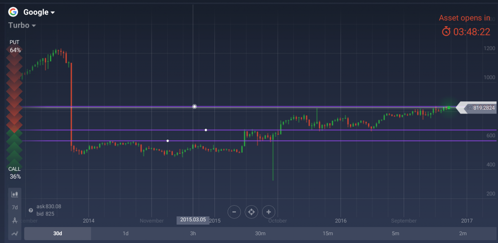
If you believe in buying and selling stocks that you believe will have nothing whatever to do with the way the wind blows in the news, which means they have nothing to do with the stock price, then you are probably aware that this is a very good way to invest.
- The first step is to identify a company that you have heard of or know has a good state of health and look at the six month general trend in their stock. This means that even if major news breaks, you do need to look at any steady rise or fall to ascertain what the market is doing
- Secondly, identify recent spikes upwards or downwards, which means that something significant is happening within the company. You need to make note of these “game changers”.
- Thirdly, you should look for chart spikes in similar stocks. If there is a general pattern in all the companies that you look at, it is usually indicative of a general sector movement and not quite as serious as individual company knee jerk movement. If it is only happening to your chosen stock you should act quickly with remedial action in your own trading options.
Binary trading does give the advantage of having short trades so long drawn out stock movement is not always what you need to look at, other than to see when to enter or leave the market based on historical evidence, which is all part of your technical analysis to keep you on track.
